Stars — colour, class, and the H–R diagram
A star's colour is a thermometer, and its brightness is a life story. Plot the two against each other and almost every star falls onto a single diagonal band — the Hertzsprung–Russell diagram, the most important graph in stellar astronomy.
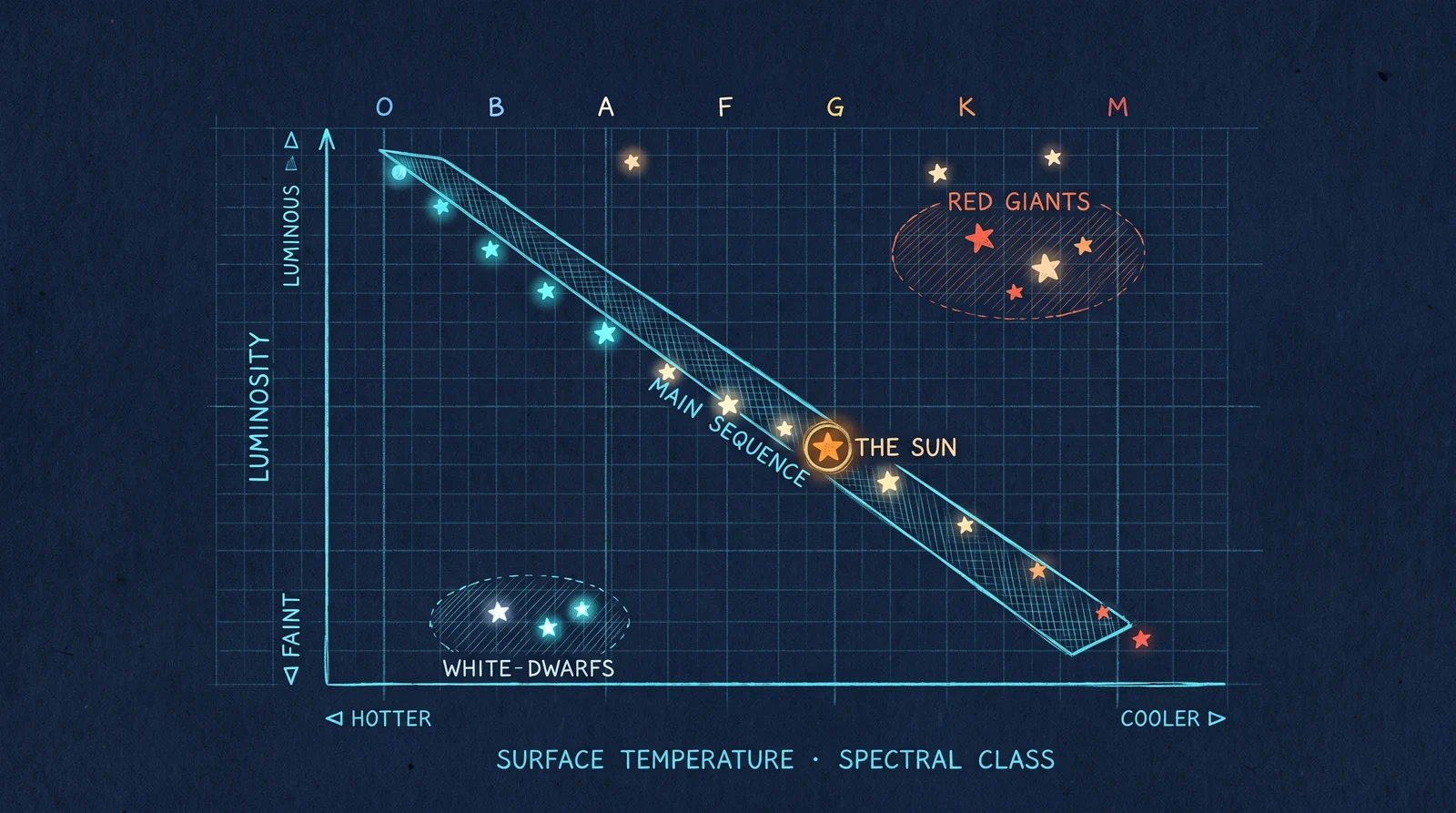
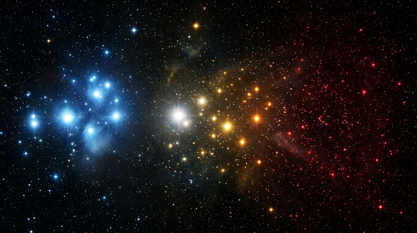
Colour comes first. A star radiates as a near-perfect blackbody, so its colour is set almost entirely by its surface temperature: hot stars glow blue-white (~30,000 K), the Sun is yellow-white (~5,800 K), and cool stars burn deep red (~3,000 K). Astronomers measure that colour as the B–V index — the difference between a star's brightness through a blue and a visual filter — and it maps cleanly onto temperature. Sort stars left-to-right by colour and you have the spectral sequence O, B, A, F, G, K, M, hottest to coolest (mnemonic: “Oh Be A Fine Girl/Guy, Kiss Me”).
Brightness is the second axis — but you have to be careful which brightness. A star can look bright because it is genuinely luminous or merely because it is close. To compare stars fairly you convert apparent magnitude m to absolute magnitude M, the brightness it would have at a standard 10 parsecs, using the distance: M = m − 5(log₁₀ d − 1). Only then does luminosity mean intrinsic power output, and only then does the diagram work.
Now plot temperature (hot on the left, by convention) against luminosity (bright at the top). The stars do not scatter randomly. Roughly 90% of them land on a single sweeping diagonal — the main sequence — running from hot, luminous, massive O and B stars at the top-left down to cool, faint red dwarfs at the bottom-right. A star sits on the main sequence for as long as it fuses hydrogen in its core, which is most of its life. The Sun is a G-type main-sequence star, sitting unremarkably near the middle.
The interesting stars are the ones off the main sequence. Top-right: the red giants and supergiants — cool but enormous and hugely luminous, stars that have exhausted their core hydrogen and swollen up (Betelgeuse, Aldebaran, Arcturus live here). Bottom-left: the white dwarfs — hot but tiny and faint, the exposed cores left when a Sun-like star dies. Where a star lands, and how it moves across the diagram over time, is the whole narrative of stellar evolution written in two coordinates.
The H–R diagram is also a distance ladder and a clock. Because a star's position fixes its true luminosity, comparing that to how bright it appears gives its distance (“spectroscopic parallax”). And because more massive stars burn out faster, the point where a star cluster's main sequence bends toward the giants — the “turn-off” — tells you the cluster's age. One graph, and you can read a star's temperature, size, power, distance, and remaining lifetime.
SEE IN THE APP
- /explore Stellar Neighborhood → HR Diagram lens: the real nearby stars re-plotted by colour × luminosity